week 3 - suitcase outlines
 ideally i'd have liked to take my own photographs of a suitcase in different positions...the only problem is i dont have one. and the wife just bought one then proceded to go to italy with it (she will be coming back, dont worry) so these are stock images i've outlined. i think open suitcases are more definable as the object. closed is just a rectangle with a handle.


week 2 - initial ideas
initial ideas:
so there's 3 quotes from three articles we have to produce a typographic response to.
here are my 3:
1) "you're dry. last time i cam here you was wet."
2) "the normal view"
3) "that doesn't work"
here are some of my initial thoughts
1) first idea that came to mind was type in an environment, photographed with something to contextualize the quote. i immediately thought of paint drying, on a fence or wall. kind of relates to the tone of the quote - quite a dry, moaning, bland column, with a dry wit. watching paint dry etc. well i thought it was clever.
2) i'm thinking some kind of 3D work with bricks, maybe against a green backdrop, highlighting the man-made overtaking the natural. hopefully it'll have a subtle subtext and not seem to preechy or conceited, which is not what i want it to be. i'm not trying to make a statement on any kind of social or environmental issues, more an observation.
3) similar grounds with this, i'm thinking anti-war/violence, but making a comment not a right out statement. so something simple and understated using type, hopefully screen printed, with small elements of firearms involved.
some quick mock ups on photoshop for the first quote:


week 1 - final article 1
my final image for the Tim Dowling article featured in the guardian magazine. i chose a more illustrative approach from knowing what kind of images accompany articles in the guardian magazine, but trying not to make it repetitive or a copy. a bit of saul bass inspired, flat colour shapes, with the sarcastic and grumpy tone of the author, so muted colours and simple lines.
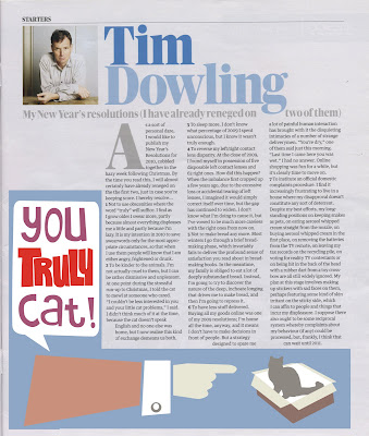
and the illustration that accompanied it originally...


and the illustration that accompanied it originally...

week 1 - final article 2
here's the second one, for the 'doctor doctor' article. it is a quite serious and imformative letters section, dealing with breast cancer and the chances of OAP's catching nasty viruses, but for some reason i constantly had this idea in my head of a grandad fighting a virus. comedy gold, i think you'll agree. so i ran with it, and though the tone of the piece is serious, its not heavy or over bearing so there was a little room for artistic license.

and the original...


and the original...


week 1 - guardian illustrations
a couple of illustrations form the guardian, plus a small photograph image. all taken from segments/columns and very relatable to the brief. they show the kind of visual aesthetic preferred by the guardian.
from tim dowlings regular column


from tim dowlings regular column


Subscribe to:
Comments (Atom)